I’m Kristina,
a graphic designer and visual storyteller

I love bringing ideas to life through thoughtful, human-centered design.
I’m originally from East Germany and have been based in beautiful Donegal for
the past 20 years and I'm currently studying graphic design at the Atlantic Technological University, where I continue to explore how design can connect people and tell meaningful stories. I’m constantly exploring new ways to grow, experiment, and learn. I believe that every project is a chance to discover something new — both about design and about myself. You’ll usually find me exploring my surroundings with my camera or practicing new painting techniques.
the past 20 years and I'm currently studying graphic design at the Atlantic Technological University, where I continue to explore how design can connect people and tell meaningful stories. I’m constantly exploring new ways to grow, experiment, and learn. I believe that every project is a chance to discover something new — both about design and about myself. You’ll usually find me exploring my surroundings with my camera or practicing new painting techniques.

My skill set includes graphic design, tone of voice / brand voice, brand guideline development, motion design, and photography.
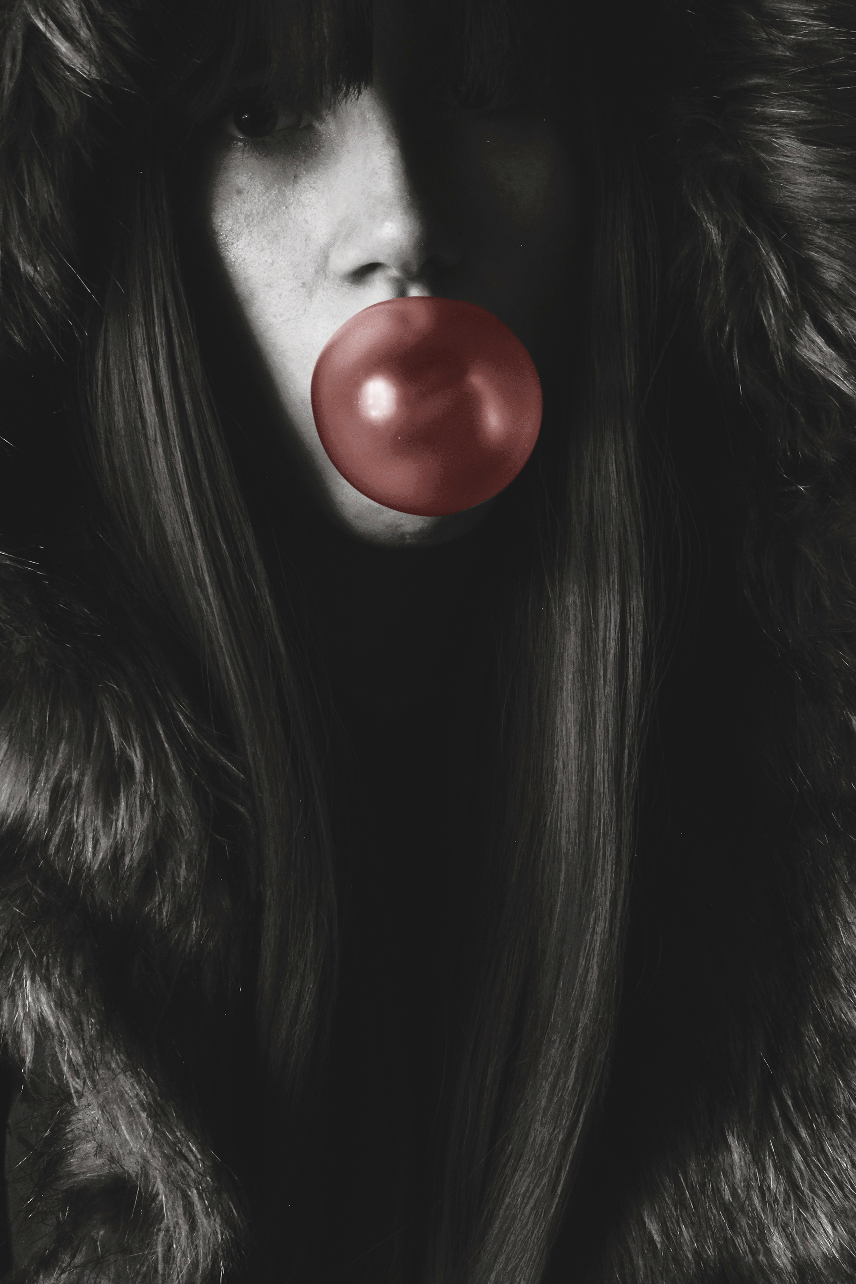
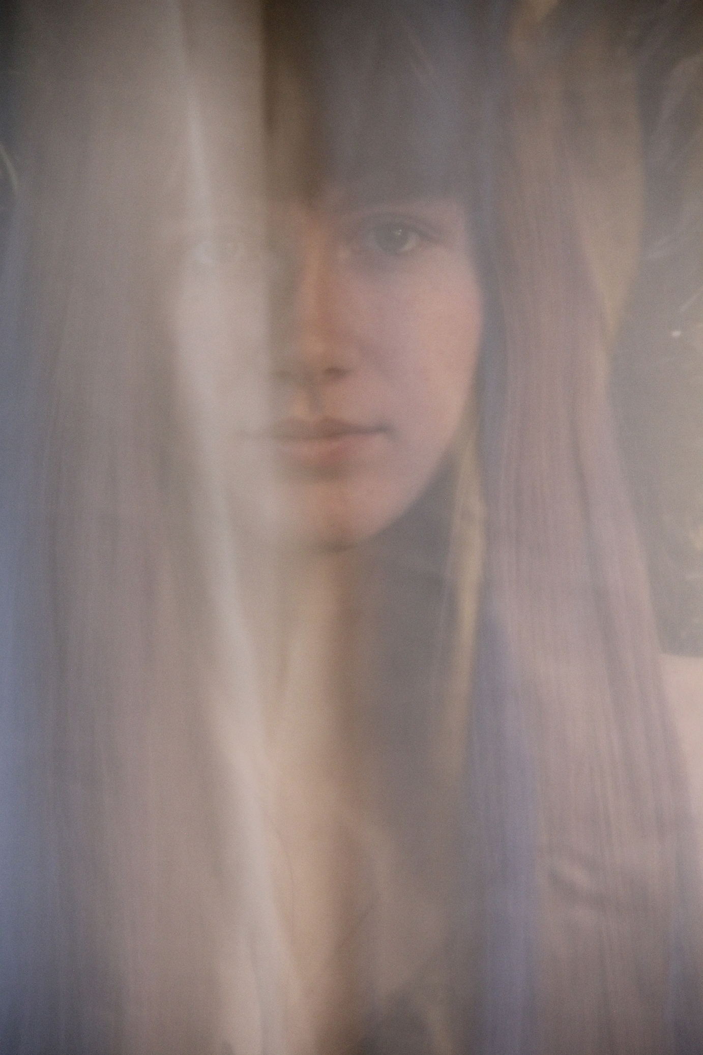
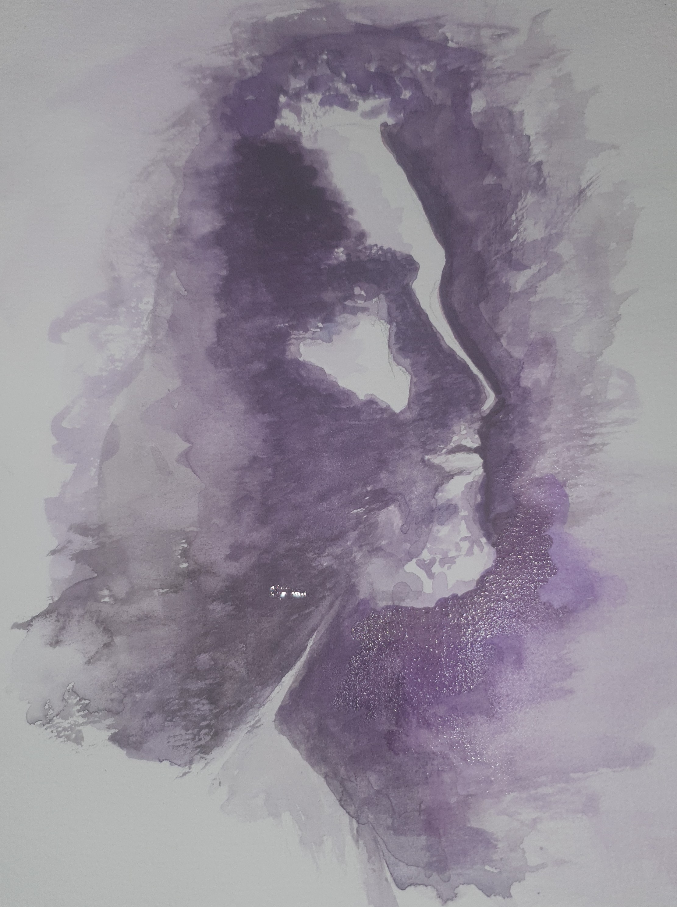
Portrait Photography: The art of capturing the essence.
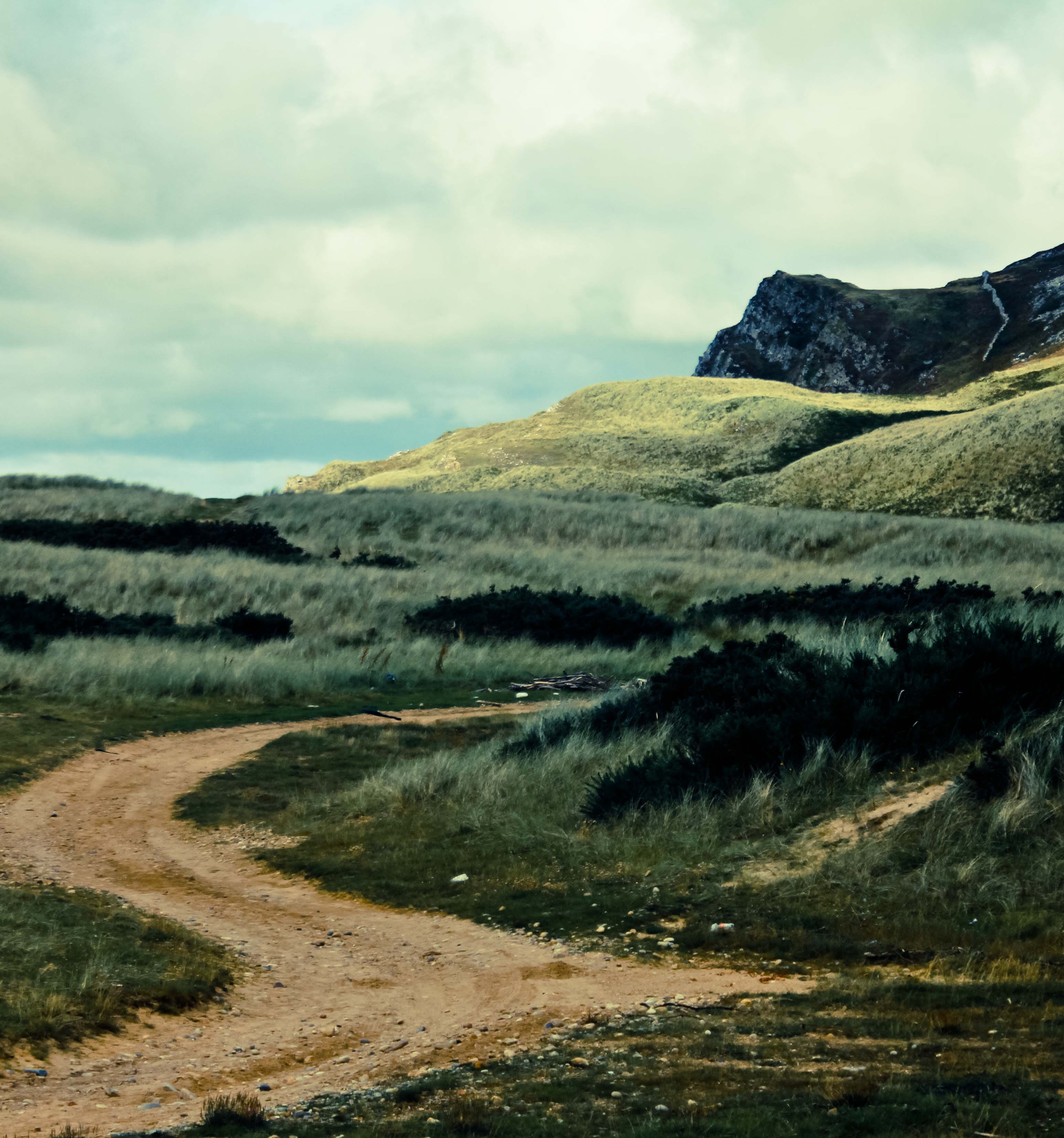
Landscape Photography: capturing the beauty of nature and the outdoors.
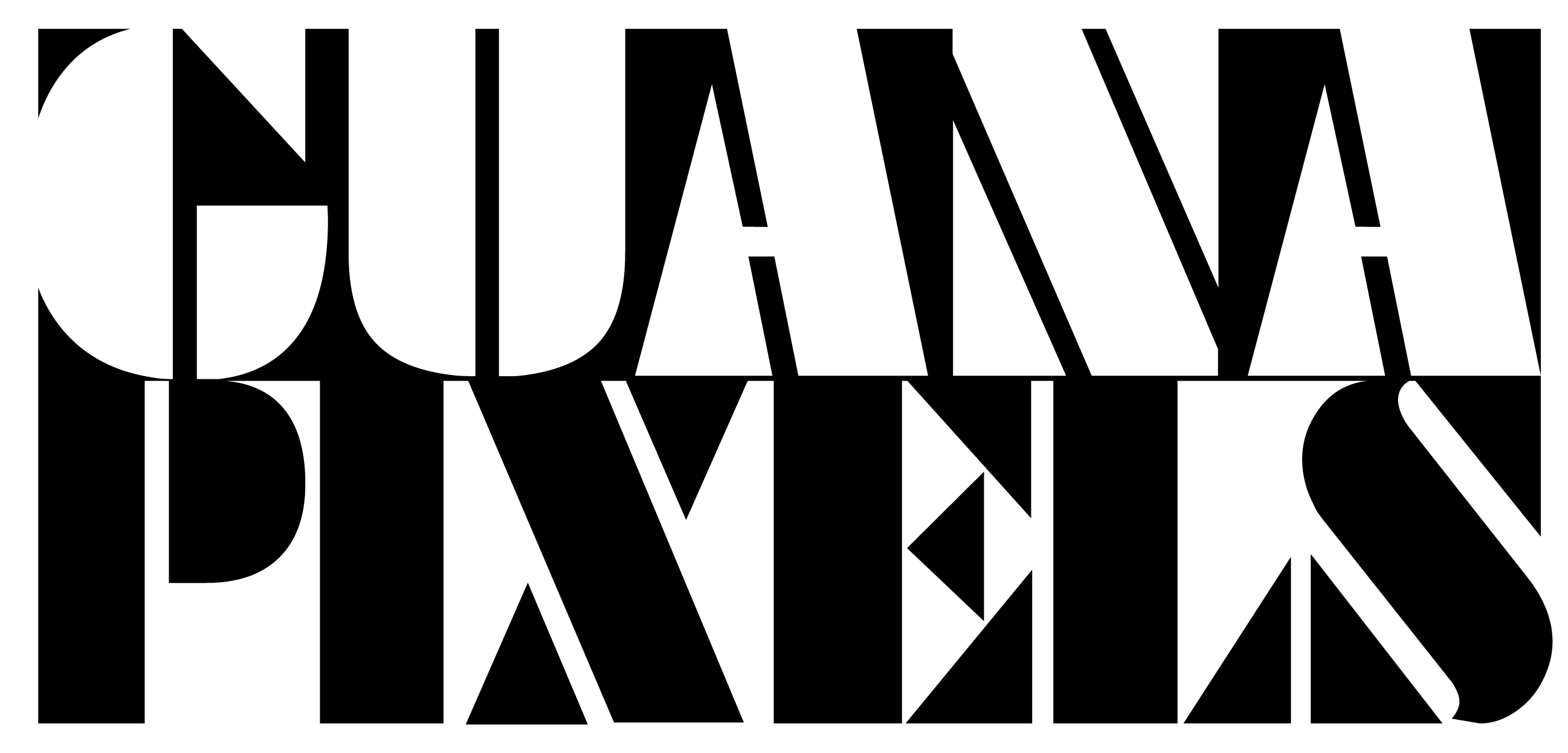
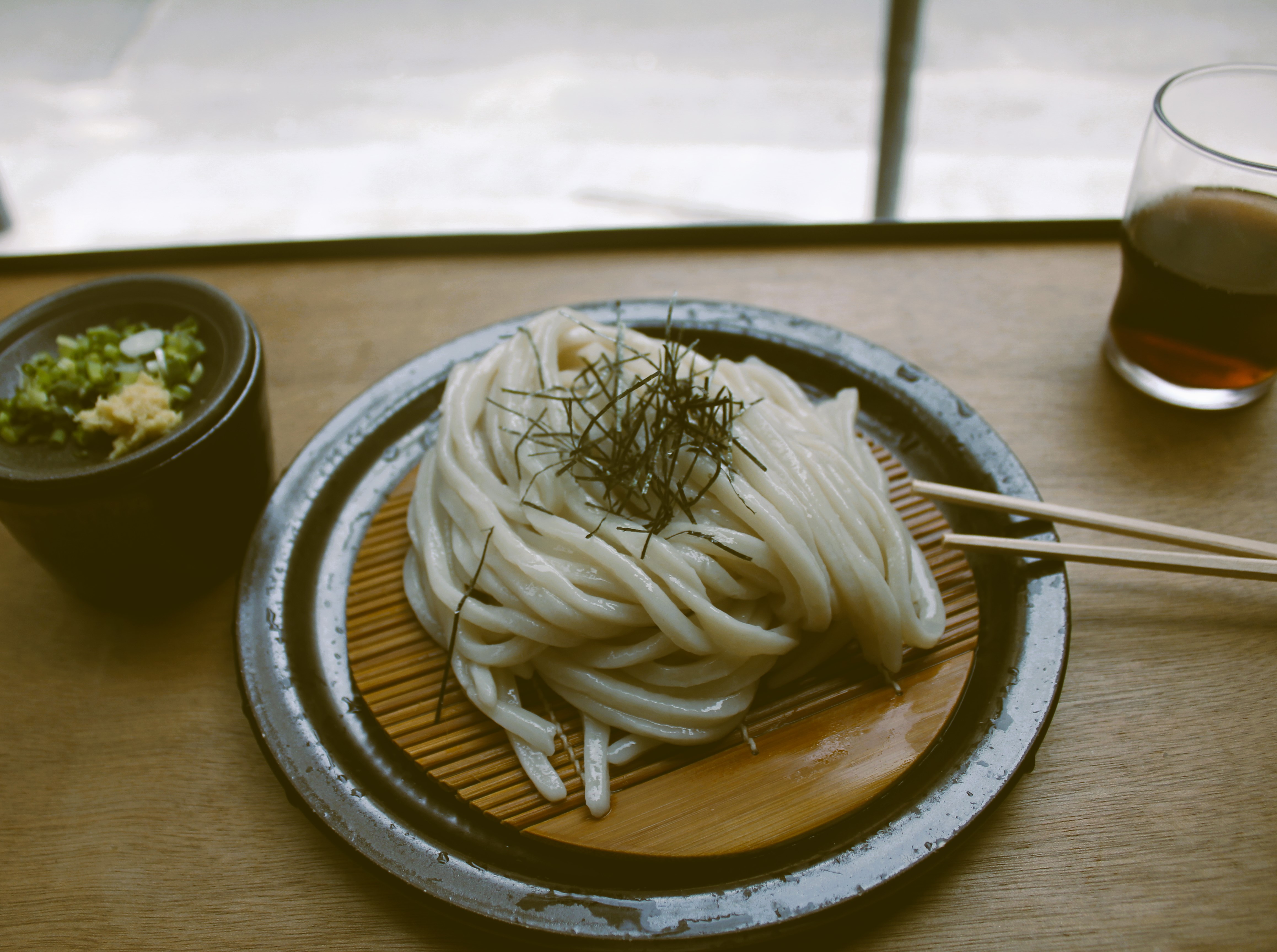
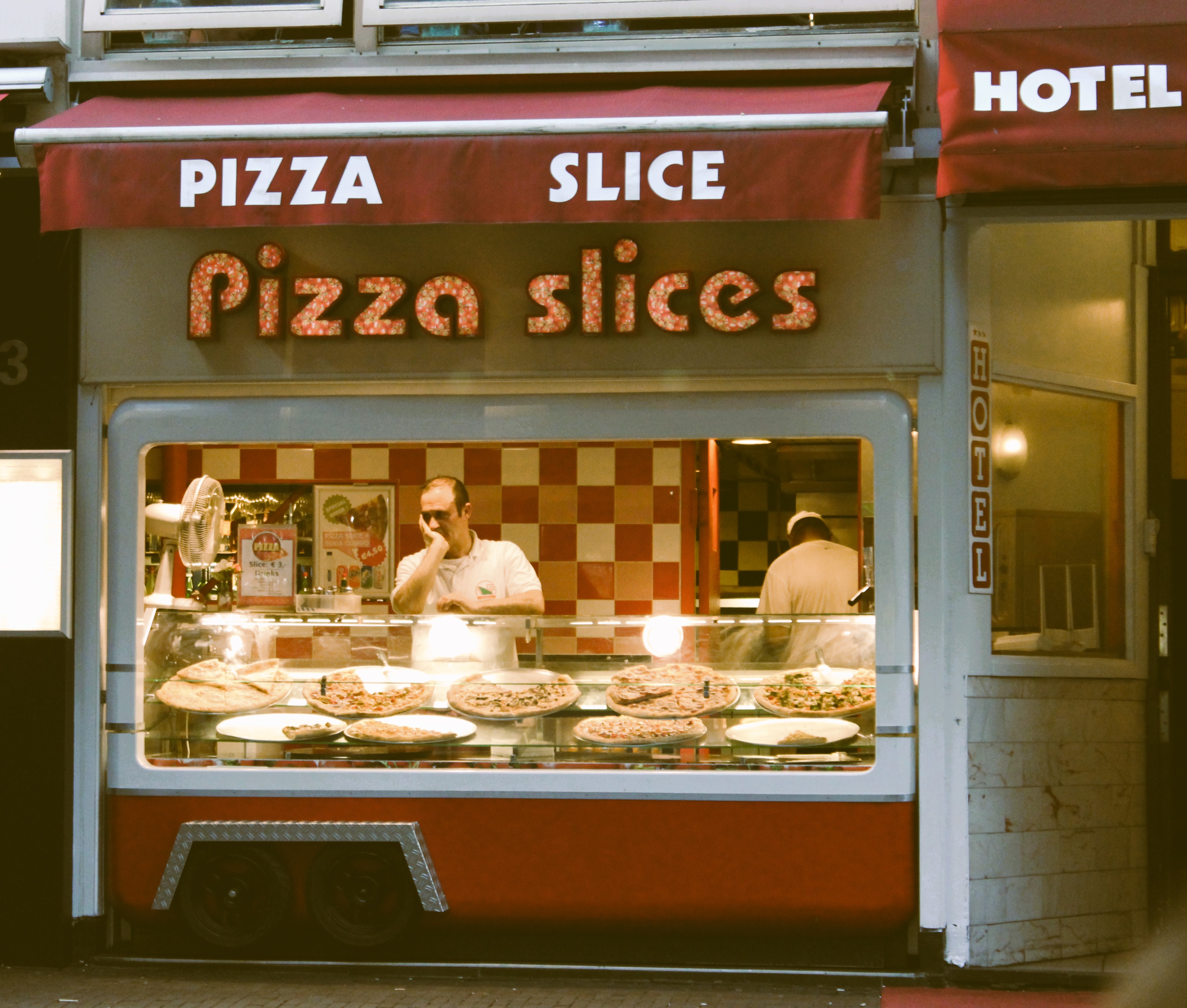
Urban Photography: focusing on architecture, people, and city environments
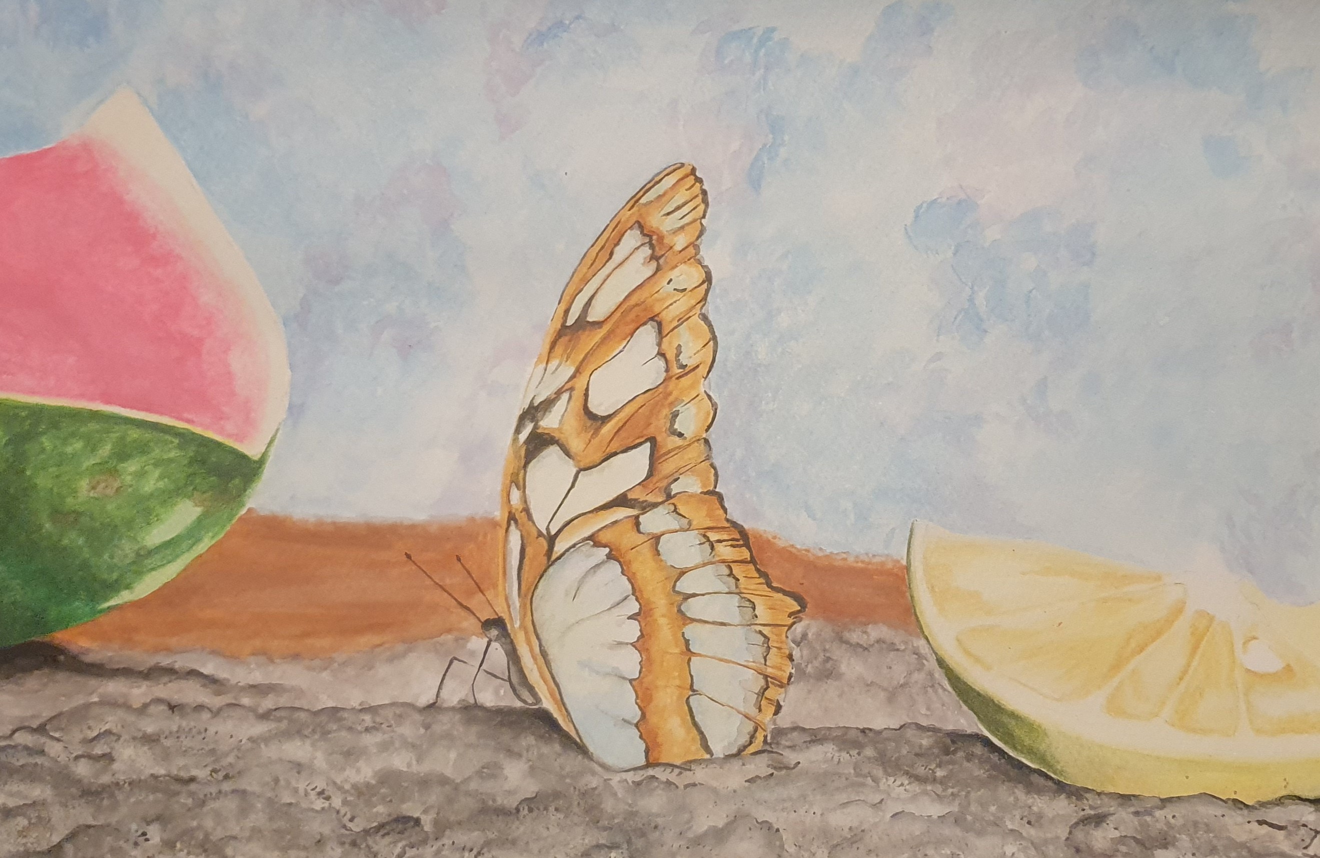
Watercolour
Eye of the Beholder
Acrylic
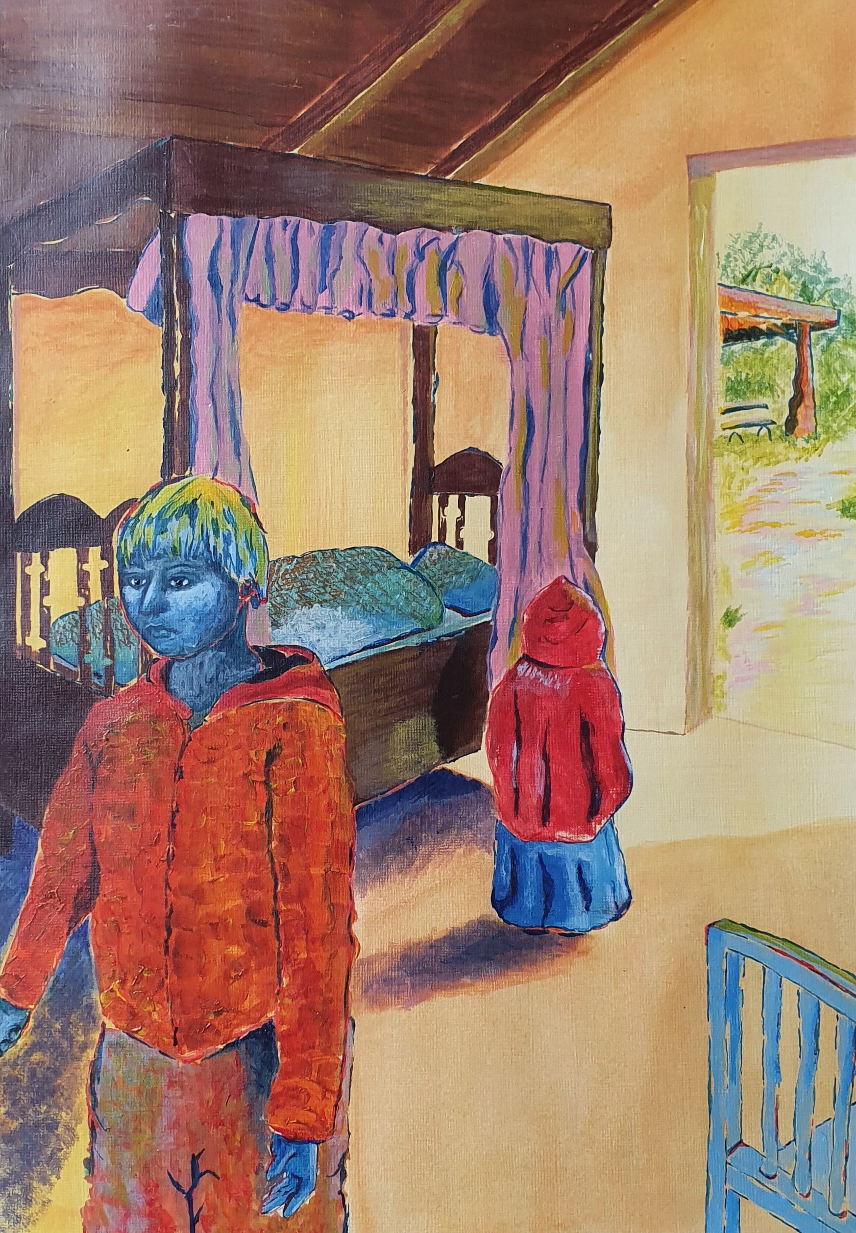
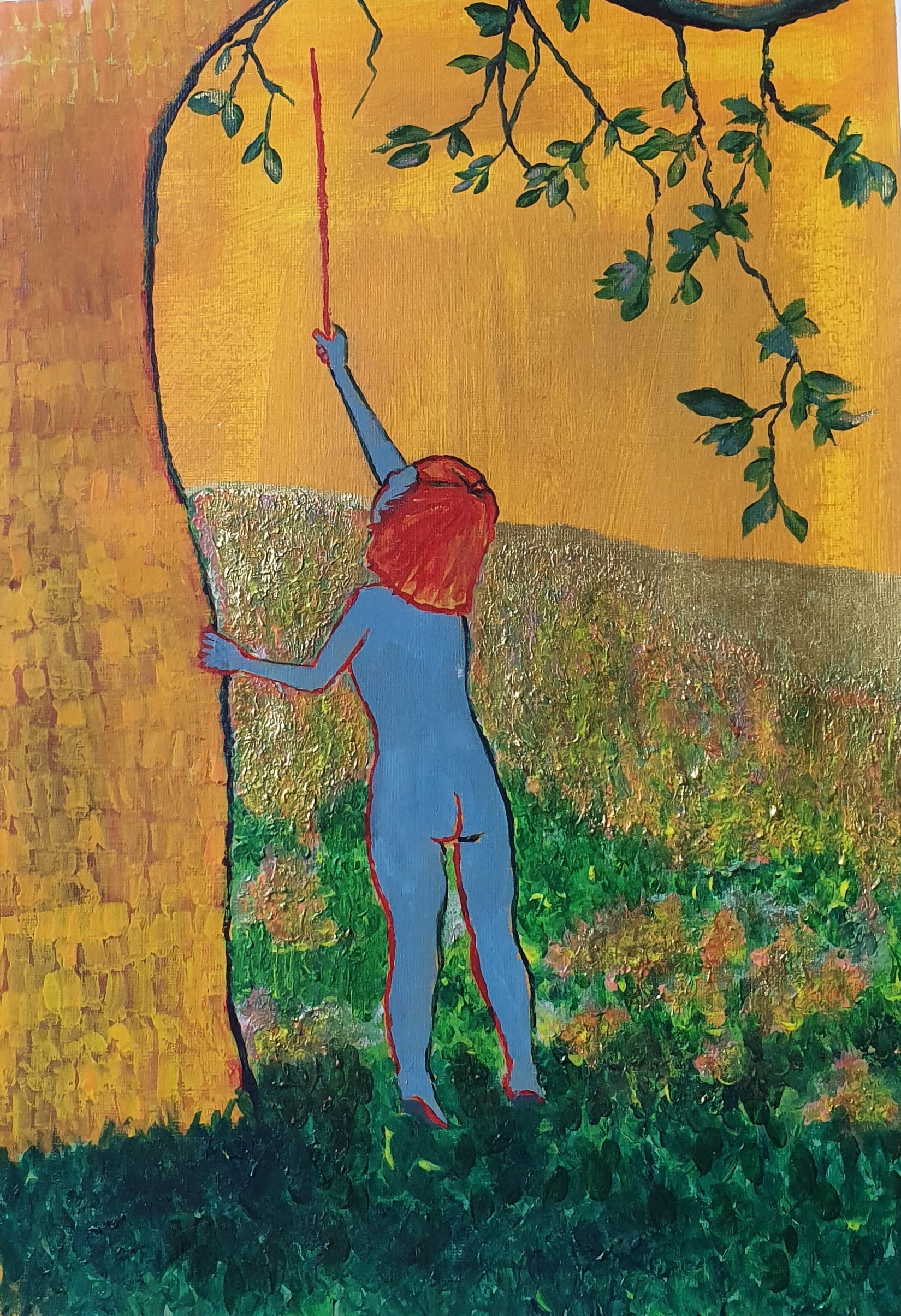
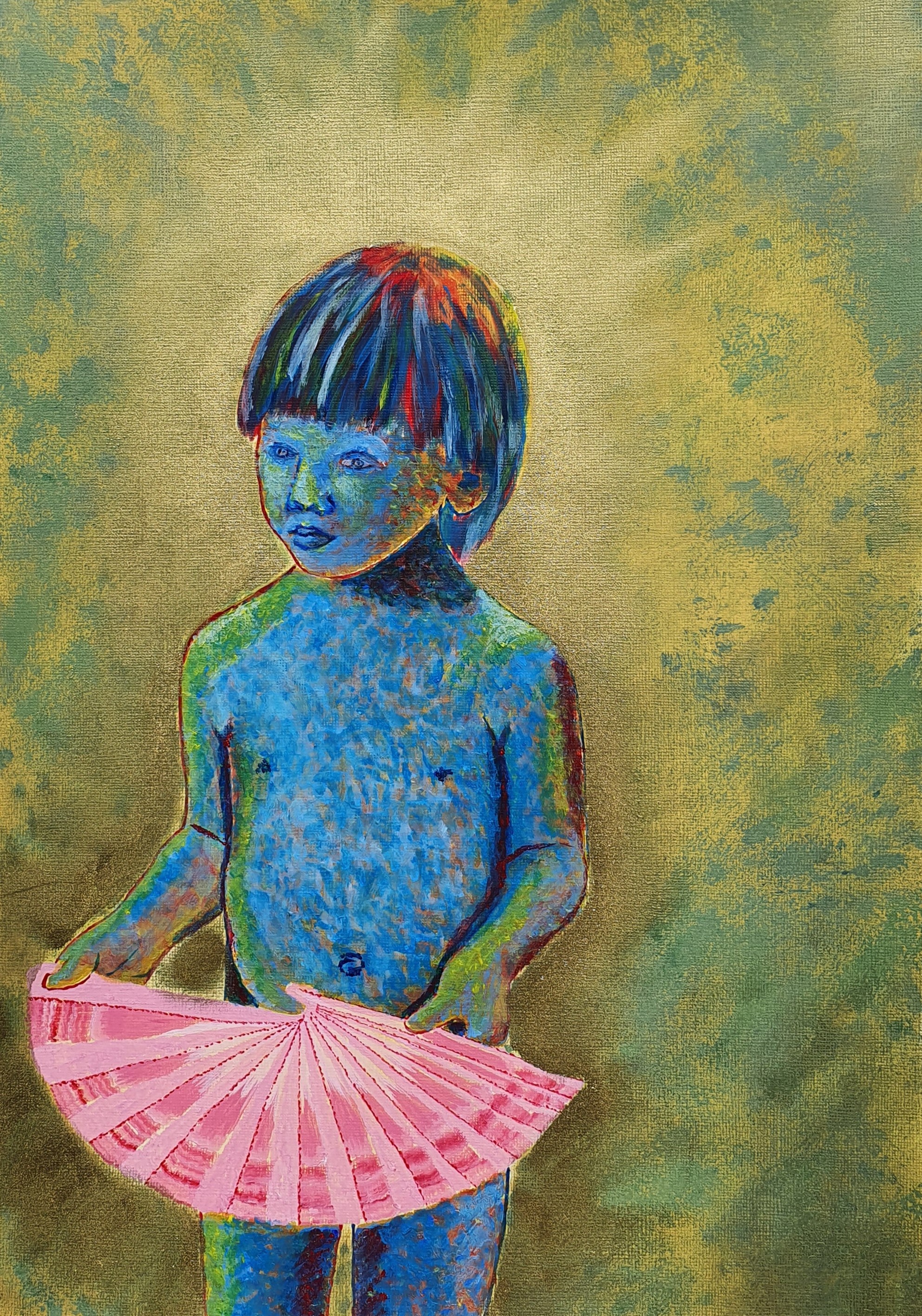
A series of paintings based on photographs I’ve taken of my son, Noah, and the environments he inhabits. In this body of work, I explore childhood through a playful, expressive style that reflects both the child before me and the child within me. My use of bold, saturated colours is deliberate: the palette seeks to evoke the vibrancy, immediacy, and commanding presence of a child.
This collection draws inspiration from three artists whose work has profoundly shaped my approach: Gustav Klimt, Vincent van Gogh, and Hundertwasser. I adopt a looser application of paint, echoing the expressive qualities often found in Impressionist and Post-Impressionist works. From van Gogh, I was particularly influenced by his use of receding colours — especially his red and blue outlines, which add depth and energy.
I also experiment with impasto techniques, layering paint to create texture and movement. A yellow-ochre imprimatura beneath many of my backgrounds allows these colours to emerge vibrantly through intentional gaps in the brushwork. Hundertwasser’s philosophy of transautomatism, along with his courageous use of the primary colours, guides my colour choices. His ability to achieve emotional intensity through a limited but powerful palette encourages me to be bold and incorporate primary hues throughout my compositions.
Klimt’s “Golden Phase” also resonates with me. I am drawn to the way gold leaf interacts with light, transforming a painting depending on the viewer’s position. Inspired by this, I incorporate gold highlights to accentuate illuminated areas and introduce a sense of shifting presence.
Reflecting on this series, I realise that the process challenged me. At times, the vivid colours felt overwhelming, and there were moments when I wanted to start over. However, working through this discomfort ultimately expanded my confidence. I have grown more at ease with expressive colour and loose brushwork, and this evolution echoes the very themes of growth and discovery that I explore in the work itself.