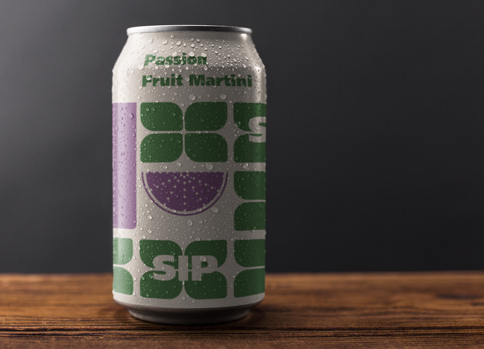
Sip
Sip Society Drinks Co. sought a new identity and packaging design for their global non-alcoholic cocktail range. The aim was to create a look that would disrupt the market and command shelf appeal, while maintaining a simple monochrome wordmark that could be understood across cultures and adaptable to future product extensions
Role
Tools
Graphic Designer, Art Director, Sound Designer, Motion Designer, Packaging Designer, Brand Designer
Adobe Photoshop, Adobe Illustrator, Music Maker, Mock-up
.png)

The “SIP” wordmark anchors the design, integrated within a system of bold geometric forms. Each flavor uses a distinct shape inspired by the drink’s flavour profile and energy. The restrained palette and repetition of core elements ensure visual unity, while the dynamic compositions create a sense of freshness and individuality.
.png)
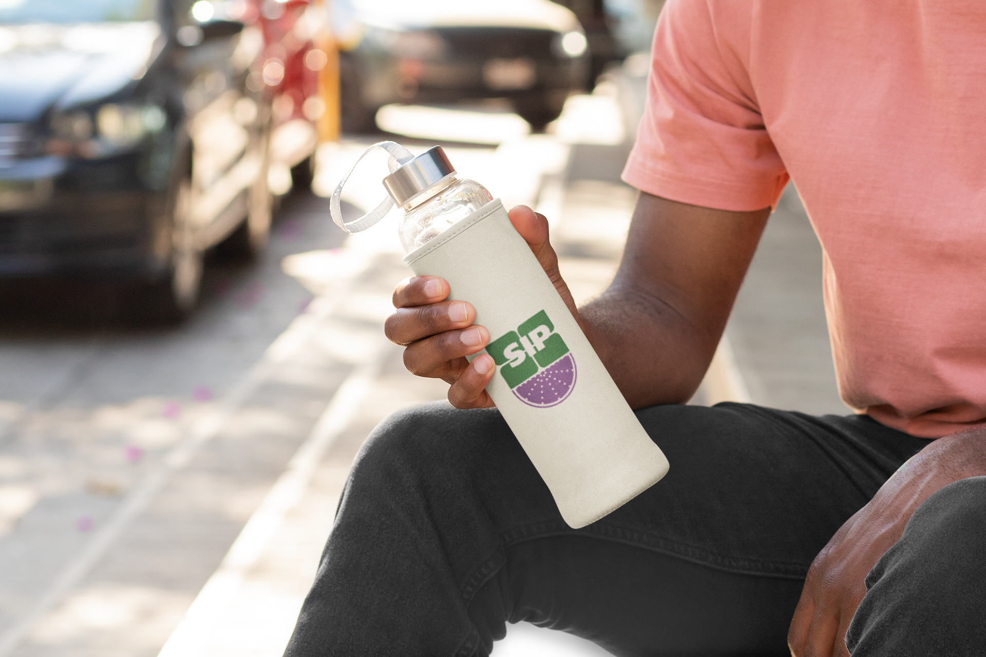
The result is a cohesive, globally adaptable packaging system that balances brand consistency with creative flexibility. The design reflects the brand’s modern, confident tone—positioning Sip Society Drinks Co. as a forward-thinking name in the non-alcoholic beverage market.